
SafetyIQ Dashboard evolution
Highlight
30% more active users, +15 min/user/week engagement
Problem
Insurance PMs were dropping off after the spending a few minutes on Dashboard. Users weren't complaining but metrics were flat and feature requests weren't moving the needle.
Solution
Interviews revealed nothing obvious. Observation did users couldn't read the graphs.
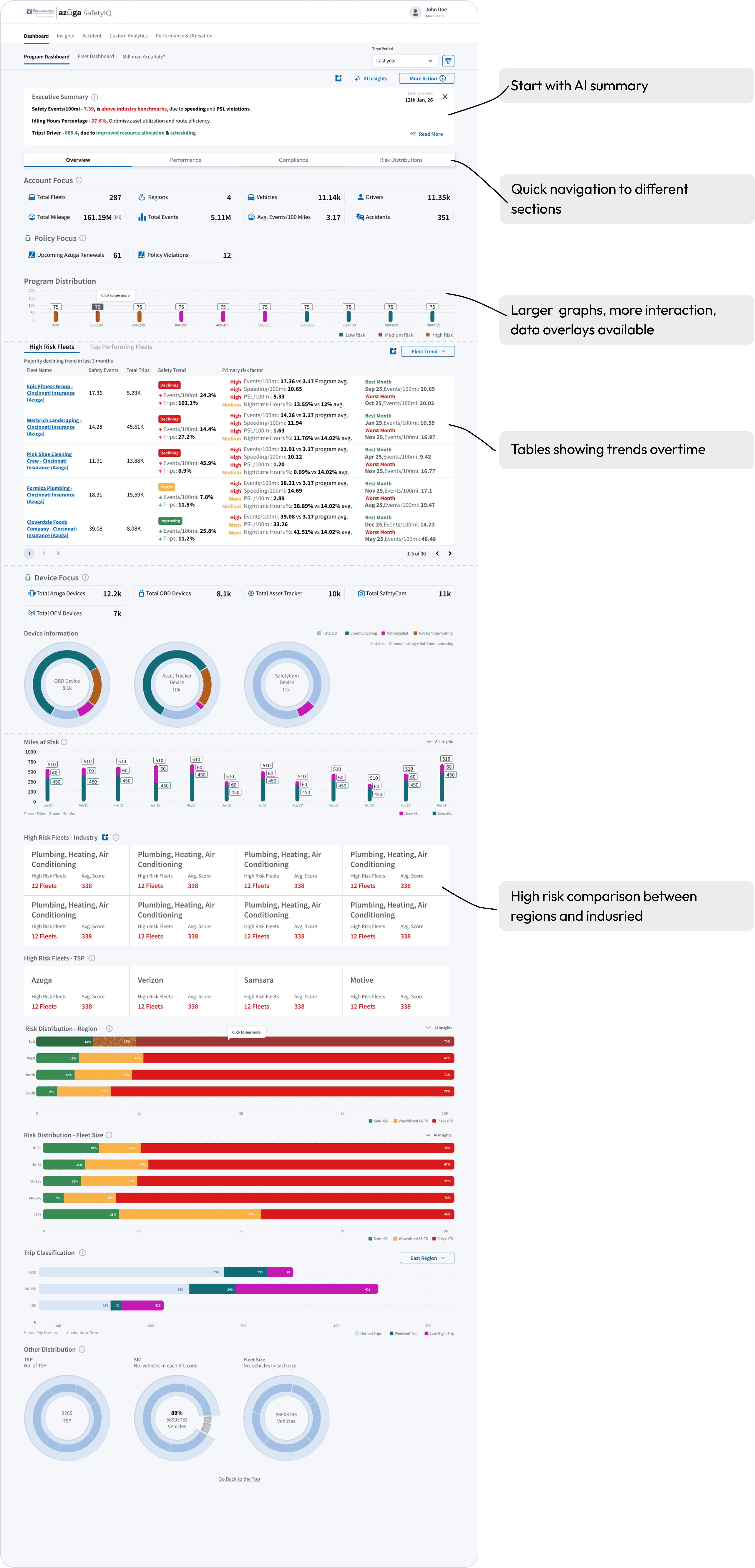
Added AI summaries per graph translating data into plain language
Added AI page-level summary giving users the full picture instantly
Rebuilt information architecture to match real user workflows
Date
Dec, 2025

30+ Insurance companies
500+ Fleets
1000s of Drivers
Millions of Data points
Couldn't answer one question
What do I do next?
Users could not decide what action to take next

Example of few metrics tracked:


Me: Can you explain what you see on the screen and what you do next?

Interviewee: …..Radio silence….
“they are not understanding the graphs”!


Insurance Program managers spent 15 minutes more time (5% increase) on the platform per week (Data given by roduct oprations)
30% more users logged into SafetyIQ in 1 month (Pendo Insight). These were the underwriters who were generally just taking information from Program managers.